Help us build this. Leave comments, suggest improvements, and help create better design documentation for agents.
Satispay
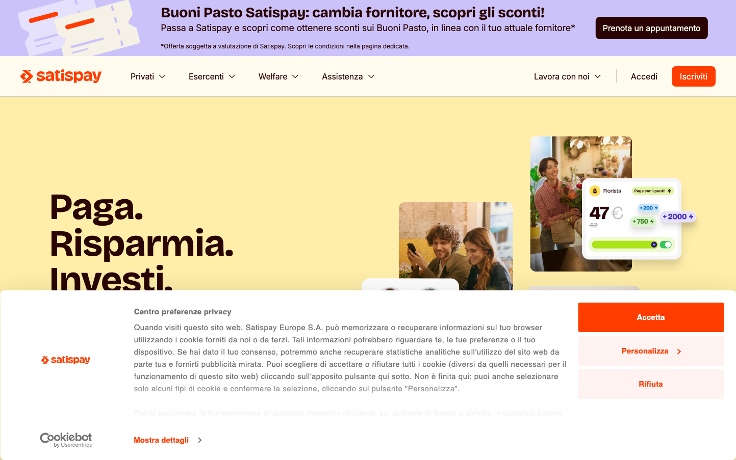
FintechSatispay combines playful warmth with financial credibility through a distinctive cream-yellow background that feels both approachable and premium. The bold Bricolage Grotesque headlines create personality while maintaining trust, supported by clean Inter body text that speaks to Italian design sophistication.
Design Identity
Signature Color
Satispay Coral
#FF5722
energetic fintech innovation with human warmth
Visual Identity
The distinctive cream-yellow background creates an immediately recognizable canvas that breaks away from typical fintech blue/white schemes, making financial services feel warm and accessible.
Component Style
Rounded corners with moderate radius (approximately 8-12px), vibrant coral primary buttons with bold text, clean cards with subtle shadows. Components feel substantial but friendly - not razor-sharp corporate, but not overly soft either.
Spacing Philosophy
Generous 80px horizontal padding creates breathing room, while the layout uses asymmetrical composition with the large headline taking up significant left-side real estate, balanced by product imagery on the right.
Design Principles
- Headlines use Bricolage Grotesque at 72px with 700 weight for maximum impact
- Body text stays at 15px with 24px line height for readability
- Primary actions use coral (#FF5722) with high contrast
- Cream-yellow background (#FFF8DC approximately) as signature canvas
- Mobile app interface cards show moderate 8-12px border radius
Target Audience
Italian millennials and Gen Z who want modern payment solutions but prefer warmth and personality over sterile corporate banking experiences
Mood
Design descriptions are AI-generated based on visual analysis and may not fully reflect the brand's official design guidelines.
Design System
Typography Scale
| Element | Font | Size | Weight | Line Height |
|---|---|---|---|---|
| body | 16px | 400 | 16px | |
| h1 | 72px | 700 | 72px | |
| h2 | 48px | 400 | 48px | |
| h3 | 28px | 600 | 28px | |
| p | 15px | 400 | 24px | |
| a | 15px | 400 | 24px | |
| button | 15px | 700 | 22.5px | |
| input | 15px | 400 | 24px |
Color Palette
#ffffff