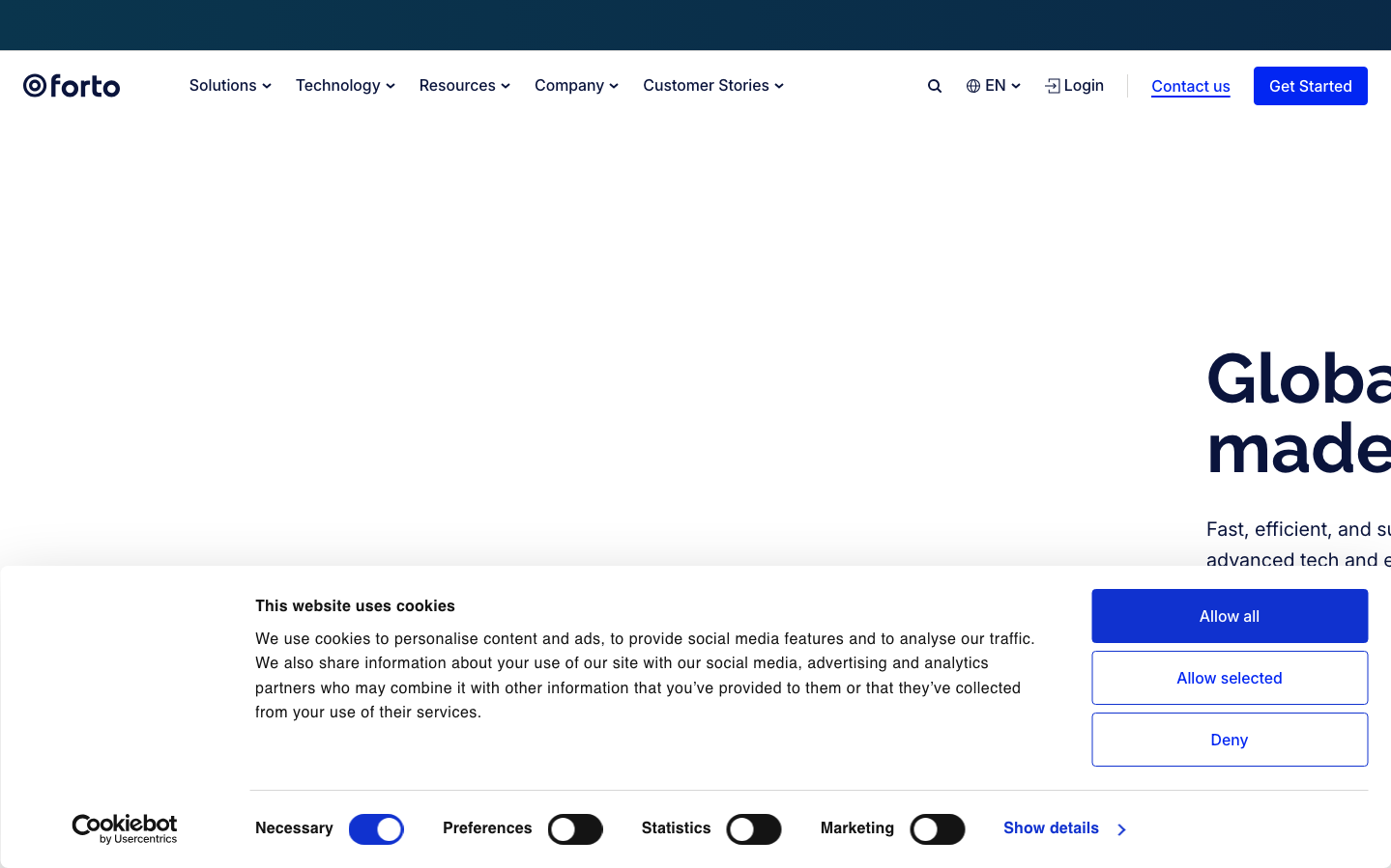
Help us build this. Leave comments, suggest improvements, and help create better design documentation for agents.
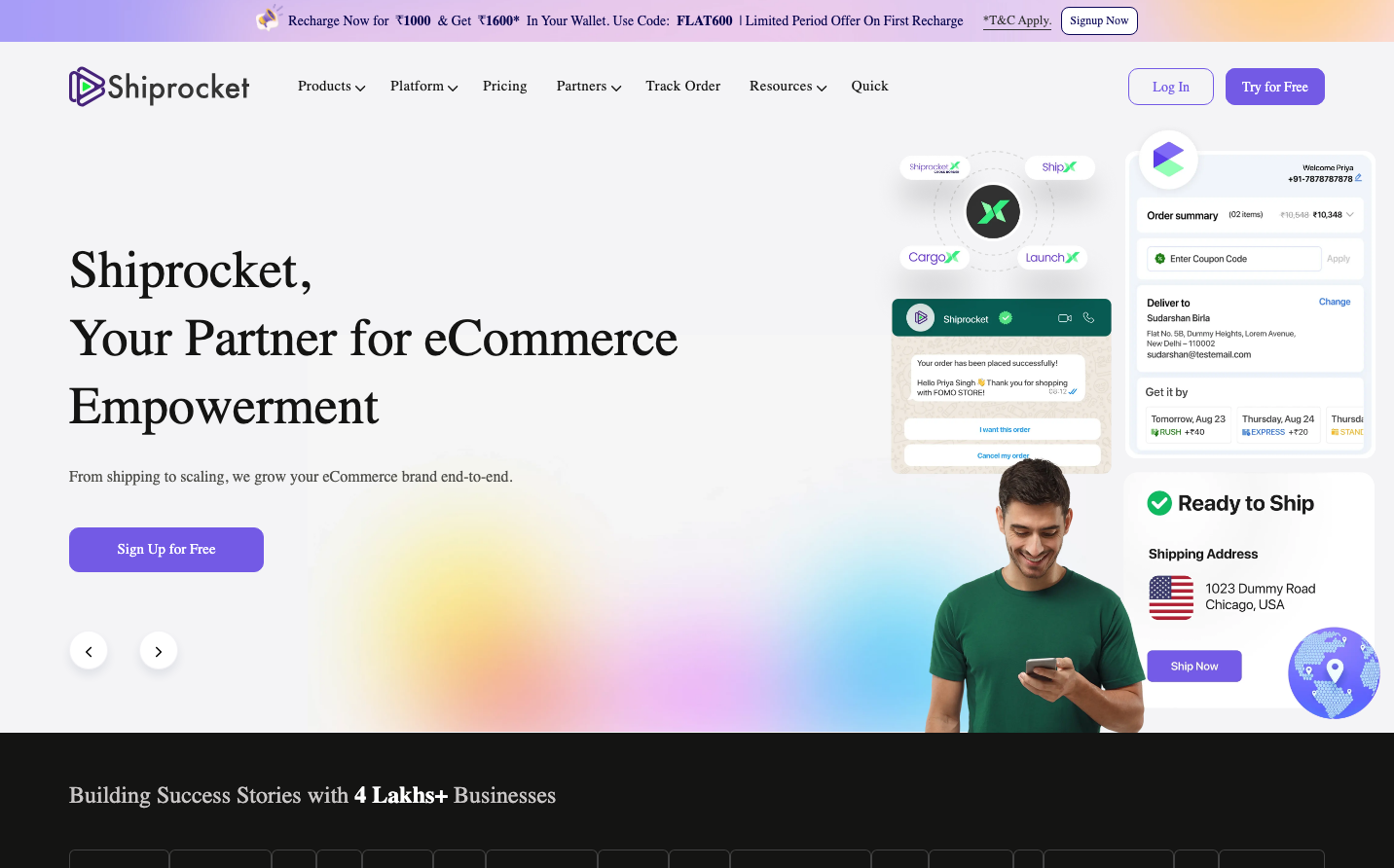
Shiprocket
LogisticsShiprocket embodies accessible enterprise efficiency with its signature purple gradient that transitions from deep violet to warm amber, creating an optimistic yet professional atmosphere. The TWKLausanne display typography paired with clean Manrope body text signals sophisticated logistics expertise while remaining approachable to growing businesses.
Design Identity
Signature Color
Shiprocket Purple
#7a00df
logistics innovation and enterprise reliability - bridging startup energy with corporate trust
Visual Identity
The distinctive purple-to-orange diagonal gradient background creates an unmistakable energetic foundation, while the asymmetrical layout with prominent shipping interface mockups immediately signals this is a shipping/logistics platform.
Component Style
Moderately rounded components (8-12px radius) with subtle shadows and clean borders. Buttons feel substantial with generous padding, cards have soft natural shadows, and the overall treatment balances professional polish with approachable warmth.
Spacing Philosophy
Generous whitespace with asymmetrical layout creates breathing room while maintaining efficiency. Large hero sections contrast with compact interface elements, reflecting the balance between big-picture strategy and operational precision.
Design Principles
- Headings use TWKLausanne at 54px/46px for impact, body text stays at 16px Manrope for readability
- Border radius consistently between 8-12px - never sharp, never fully rounded
- Purple (#7a00df) anchors the brand while gradients add energy without overwhelming
- Natural shadows (6px 6px 9px rgba(0,0,0,0.2)) preferred over harsh effects
- Interface mockups always show real shipping workflows, not abstract designs
Target Audience
Growing e-commerce business owners and operations managers who need enterprise-grade shipping solutions but want approachable, user-friendly interfaces over complex freight forwarding systems.
Mood
Design descriptions are AI-generated based on visual analysis and may not fully reflect the brand's official design guidelines.
Design System
Typography Scale
| Element | Font | Size | Weight | Line Height |
|---|---|---|---|---|
| body | 16px | 400 | 22.4px | |
| h1 | 54px | 400 | 70px | |
| h2 | 46px | 400 | 65px | |
| h3 | 24px | 400 | 32px | |
| h4 | 32px | 500 | 46px | |
| h5 | 22px | 500 | 28px | |
| p | 14px | 400 | 19.6px | |
| a | 12px | 400 | 16.8px | |
| button | 15px | 300 | 19.5px | |
| nav | 16px | 400 | 22.4px |
Color Palette
#7a00df#007cba#006ba1#005a87#000000#abb8c3#ffffff#f78da7#cf2e2e#ff6900#fcb900#7bdcb5