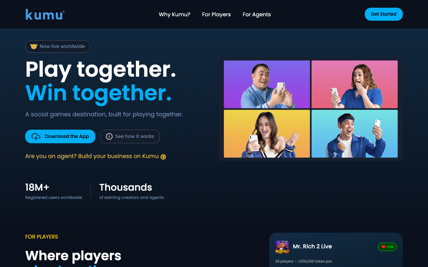
Help us build this. Leave comments, suggest improvements, and help create better design documentation for agents.
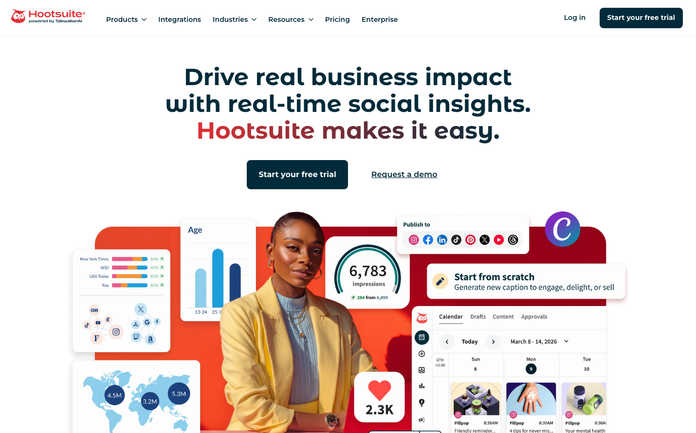
Hootsuite
SocialHootsuite's brand exudes professional warmth through its distinctive dual palette of deep oceanic teal (#012b3a 'nocturn') and energetic coral red (#e03035 'saffron'). The Montserrat typography family creates approachable sophistication, while the interface balances data-rich social media dashboards with human-centered design that feels both analytical and emotionally engaging.
Design Identity
Signature Color
Hootsuite Saffron
#e03035
energetic social engagement and brand passion - the emotional heartbeat that transforms dry analytics into human connection
Visual Identity
The distinctive coral-to-deep-teal gradient overlays combined with rounded-corner interface cards floating over colorful data visualization backgrounds - creating a signature 'social dashboard aesthetic' that balances professional analytics with human warmth.
Component Style
Softly rounded 8px corner cards with subtle drop shadows, floating over gradient backgrounds. Interface elements have gentle depth with refined shadow treatments, creating a approachable yet professional feel. Buttons are moderately rounded with confident padding, avoiding both sharp corporate coldness and overly playful roundness.
Spacing Philosophy
Generous breathing room around hero content with compact, efficient spacing within dashboard interfaces. The layout creates distinct content zones - expansive marketing areas contrasted with dense, information-rich product interfaces that maximize social media management efficiency.
Design Principles
- Dual personality design: expansive marketing pages vs. compact dashboard interfaces
- 8px border radius maximum for warm professionalism
- Gradient overlays always transition from warm (saffron) to cool (nocturn) tones
- Montserrat font weights: 500 for body, 600 for buttons, 700 for headlines only
- Shadow depth increases with component importance: 10px for cards, 20px+ for modals
Target Audience
Social media managers and marketing professionals who need powerful analytics tools but value human-centered design over sterile enterprise software
Mood
Design descriptions are AI-generated based on visual analysis and may not fully reflect the brand's official design guidelines.
Design System
Typography Scale
| Element | Font | Size | Weight | Line Height |
|---|---|---|---|---|
| body | 16px | 500 | 25.6px | |
| h1 | 48px | 700 | 55.2px | |
| h2 | 36px | 700 | 41.4px | |
| h3 | 28px | 700 | 32.2px | |
| p | 16px | 500 | 25.6px | |
| a | 16px | 700 | 25.6px | |
| button | 14px | 600 | 21px | |
| input | 16px | 500 | 20.8px | |
| nav | 16px | 500 | 25.6px | |
| header | 16px | 500 | 25.6px |
Color Palette
#ffffff#012b3a#e03035#ffedec#f7f9f9#f2f4f5#d9dfe1#bfcace#80959c#687f87#41606b#7600b8