Help us build this. Leave comments, suggest improvements, and help create better design documentation for agents.
ShareChat
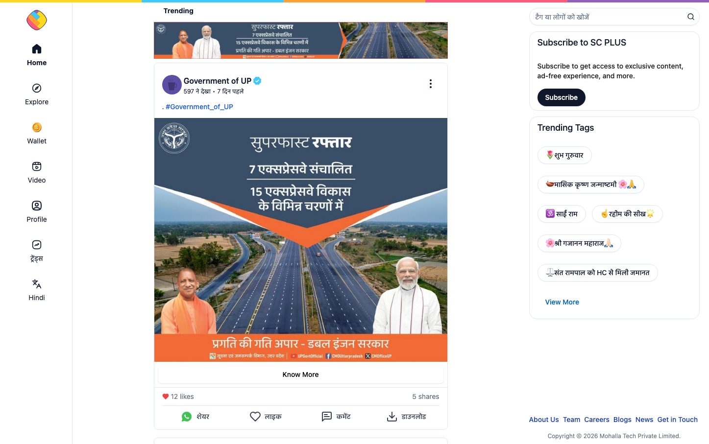
SocialShareChat employs a distinctly Indian social platform aesthetic with bold gradient color overlays and vernacular typography. The design balances governmental authority with grassroots accessibility through rich orange-blue gradients and Hindi-forward content presentation.
Design Identity
Signature Color
Bharat Orange
#ea580c
Cultural pride and governmental progress - connecting traditional Indian identity with digital modernization
Visual Identity
Diagonal gradient overlays on infrastructure photography with dual-language typography hierarchy - Hindi headlines prominently displayed above English subtext, creating a distinctly Indian digital governance aesthetic.
Component Style
Rounded profile avatars with verification badges, soft pill-shaped interaction buttons with generous padding. Cards feature subtle shadows and gentle corner radius, prioritizing approachability over corporate sharpness.
Spacing Philosophy
Compact vertical rhythm optimized for mobile consumption with tight 8-12px internal spacing. Content cards stack closely to maximize information density while maintaining breathing room around key CTAs.
Design Principles
- Hindi text always takes visual precedence over English translations
- Orange-to-blue gradients span full content width for impact
- Profile imagery uses consistent circular cropping at 40-48px
- Verification badges appear as blue checkmarks adjacent to usernames
- All interactive elements maintain minimum 44px touch targets
Target Audience
Hindi-speaking Indian users seeking government updates and regional social content - digitally engaged but culturally rooted citizens
Mood
Design descriptions are AI-generated based on visual analysis and may not fully reflect the brand's official design guidelines.
Design System
Typography Scale
| Element | Font | Size | Weight | Line Height |
|---|---|---|---|---|
| body | 16px | 400 | 24px | |
| p | 16px | 400 | normal | |
| a | 16px | 400 | 24px | |
| button | 14px | 700 | 20px | |
| input | 14px | 400 | 20px | |
| nav | 16px | 400 | 24px | |
| header | 16px | 400 | 24px | |
| footer | 16px | 400 | 24px |
Color Palette
#e9d5ff#a21caf#f4f4f5#e4e4e7#fecdd3#e2e8f0#0ea5e9#ec4899#7c3aed#ea580c#7f1d1d#9a3412