Help us build this. Leave comments, suggest improvements, and help create better design documentation for agents.
Kumu
SocialKumu embraces a bold gaming-meets-social platform aesthetic with vibrant electric blue accents against deep midnight backgrounds. The Poppins typography creates approachable warmth while massive 72px headings command attention, evoking the energy of competitive gaming and community connection.
Design Identity
Signature Color
Kumu Electric Blue
#00BFFF
gaming excitement and social connection energy
Visual Identity
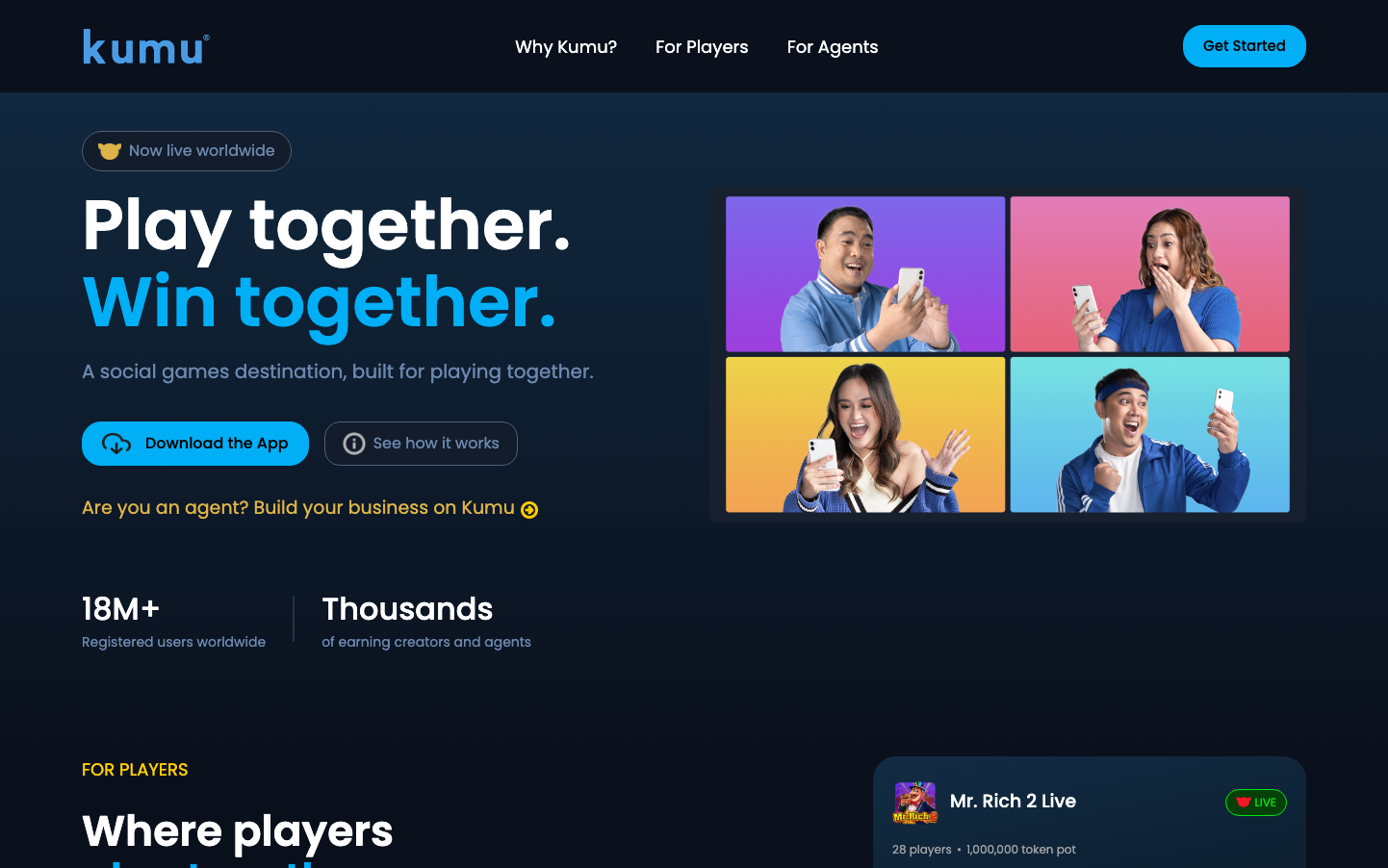
The distinctive four-quadrant grid of people on colorful backgrounds (purple, pink, yellow, cyan) creates an instantly recognizable social gaming aesthetic that screams 'play together'
Component Style
Rounded pill-shaped buttons with generous padding and bold colors. The primary CTA uses high-contrast electric blue with clean white text, while secondary buttons have subtle borders. Everything feels friendly and approachable with soft 24px+ border radius throughout.
Spacing Philosophy
Dramatic contrast between tight groupings and expansive breathing room. The hero section uses massive vertical gaps (80px+) while component internals stay intimate with 12-16px padding, creating rhythm that mirrors gaming excitement and rest.
Design Principles
- Hero typography scales to 72px for maximum impact
- Border radius consistently 24px+ for friendly approachability
- Dark navy (#1a2332 approx) backgrounds with bright accent pops
- Four-color people grid as signature visual element
- Poppins font family exclusively for warmth and gaming appeal
Target Audience
Social gamers and content creators aged 18-35 who value community, competition, and earning potential through gaming skills
Mood
Design descriptions are AI-generated based on visual analysis and may not fully reflect the brand's official design guidelines.
Design System
Typography Scale
| Element | Font | Size | Weight | Line Height |
|---|---|---|---|---|
| body | 16px | 400 | 24px | |
| h1 | 72px | 600 | 80px | |
| h2 | 18px | 400 | 27px | |
| h3 | 44px | 600 | 50px | |
| p | 16px | 400 | 26px | |
| a | 16px | 400 | 24px | |
| footer | 16px | 400 | 24px | |
| main | 16px | 400 | 24px |
Color Palette
#000000#ffffff