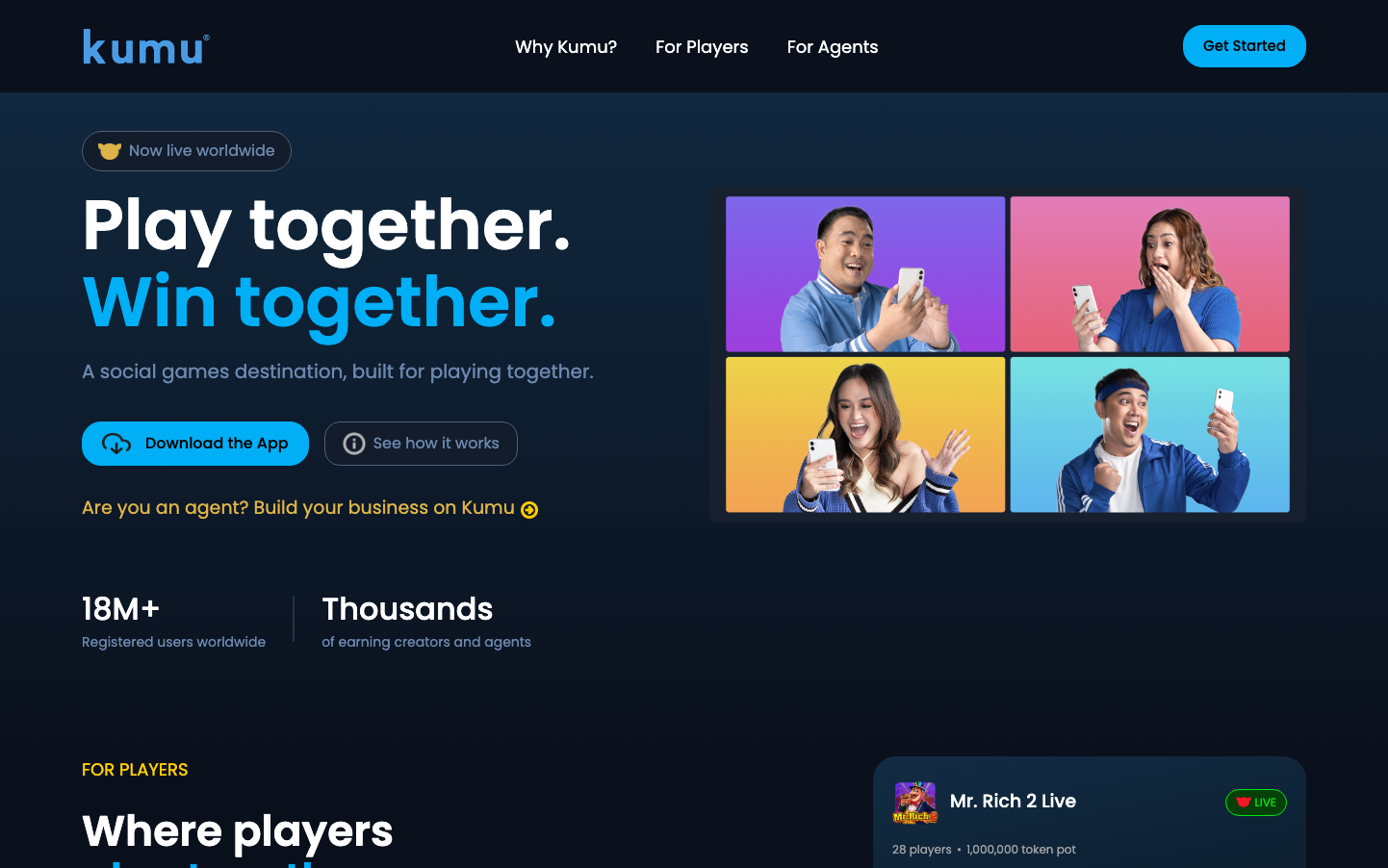
Help us build this. Leave comments, suggest improvements, and help create better design documentation for agents.
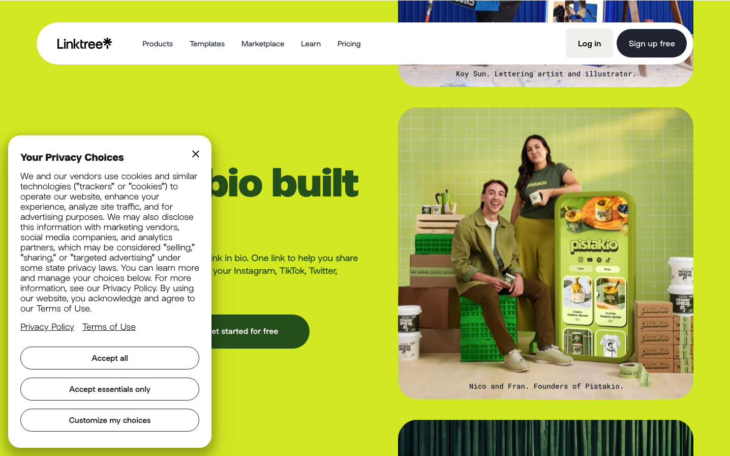
Linktree
SocialLinktree's brand radiates creative energy through an electric lime-green palette that screams Gen-Z authenticity and digital rebellion. The bold, geometric 'Linksans' typography paired with vibrant user-generated content creates a playground aesthetic that celebrates individual expression and creative entrepreneurship.
Design Identity
Signature Color
Electric Lime
#a8bb00
digital creativity and youthful rebellion - the anti-corporate color that empowers creators
Visual Identity
The signature lime-green accent combined with real creator photography in grid layouts - Linktree showcases authentic user content rather than polished stock imagery, making creators the heroes of their own brand story.
Component Style
Soft, approachable rounded corners with medium border radius (likely 12-16px). Components feel friendly and tactile with generous padding, subtle shadows, and that signature lime-green creating warm, inviting touchpoints that encourage interaction.
Spacing Philosophy
Generous breathing room with large gaps between sections (60px+) creating a gallery-like feel. Tight internal component spacing keeps things organized while the overall layout feels expansive and showcase-worthy.
Design Principles
- Typography uses only Linksans custom font family across all elements
- Lime green (#a8bb00) appears as primary accent, never as dominant background
- Real creator photography takes precedence over illustrations
- Border radius consistently medium (12-16px) - never sharp, never pill-shaped
- Grid layouts showcase multiple creators simultaneously
Target Audience
Gen-Z and millennial content creators, influencers, and digital entrepreneurs who need to monetize their online presence across multiple platforms
Mood
Design descriptions are AI-generated based on visual analysis and may not fully reflect the brand's official design guidelines.
Design System
Typography Scale
| Element | Font | Size | Weight | Line Height |
|---|---|---|---|---|
| body | 16px | 400 | 24px | |
| h1 | 73.3333px | 800 | 78.4666px | |
| h2 | 50.9px | 700 | 53.954px | |
| h3 | 25.45px | 500 | 33.085px | |
| h4 | 21.8px | 500 | 32.7px | |
| p | 16.6px | 400 | 24.9px | |
| a | 14.5px | 400 | 19.08px | |
| input | 14.5px | 500 | 21.75px | |
| nav | 16px | 400 | 24px |
Color Palette
#1e2330#e9c0e9#000000#780016#f3f3f1#060606#e6e5e6#a8bb00#0d0e05#e6f0bb#0d0e07#ececec